
Does the size difference between two bars in a White House chart of U.S. steel production show the actual rate of growth from 2024 to 2025? No, that's not true: The bar representing 2025 is twice the size of the 2024 bar, which visually suggests a 100% increase. That's the result of what statisticians call a "truncated axis" that tends to exaggerate rates of change in data. The numeric increase in steel production, from 80.8 million tons in 2024 to 81.8 million in 2025, is about 1.24%.
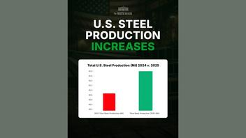
The chart appeared in a Jan. 30 post (archived here) on the White House X account, with text accompanying it that read: "American steel is BACK". The chart in the post was headed
U.S. STEEL PRODUCTION INCREASES.
Total U.S. Steel Production (Mt) 2024 v. 2025
Here's what the post looked like on X when this fact check was written:
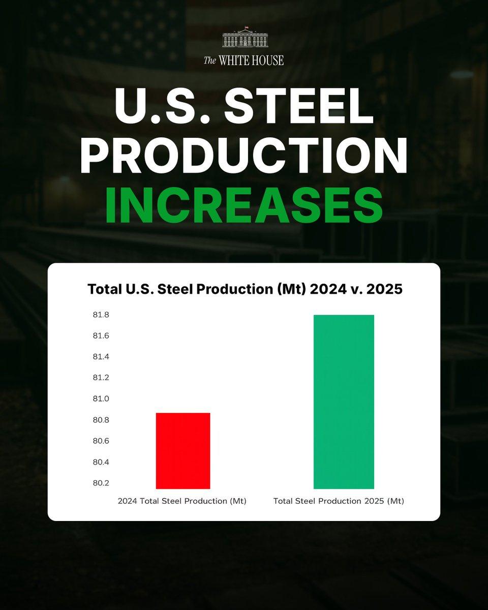
(Image source: Lead Stories screenshot of post at https://x.com/WhiteHouse/status/2017370992436249025.)
By zooming the Y-axis in to start at 80.2 million tons, the next year's increase appears more dramatic. This is what statisticians and data visualization experts like Michael Correll call a "truncated axis", described in his paper on the topic: "Truncating the Y-Axis: Threat or Menace?" (archived here).
Here's what a decade of steel production data looks like in a standard chart of US Geologic Survey data. When the Y-axis is not truncated and looks at the total amount of production, the 2024-to-2025 (archived here) comparison shows 2025 is a relatively minor uptick, compared to years of major change such as 2020 (archived here) when the pandemic recession squashed demand for steel and 2021 (archved here), when the economy re-opened and demand ramped back up:
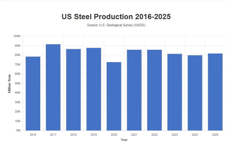
(Image source: Lead Stories chart of data from the White House and from usgs.gov/periodicals-iron-steel.pdf)