
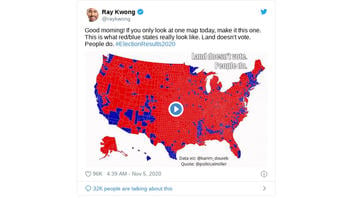
Is this GIF a data visualization of how the country voted in the 2020 presidential election? No, that's not true: It is a visualization of data from the 2016 election. The GIF makes a commentary on how traditional red-and-blue electoral maps can be misleading to some, as they are often awash with red in large geographic swaths of the country when presidential races are extremely close because of votes in more densely populated but geographically smaller blue areas.
The claim appeared in a tweet (archived here) published by @raykwong on November 5, 2020, with the caption:
Good morning! If you only look at one map today, make it this one. This is what red/blue states really look like. Land doesn't vote. People do. #ElectionResults2020
This is what the post looked like on Twitter at the time of writing:

(Source: Twitter screenshot taken on Fri Nov 6 17:38:44 2020 UTC)
A version of the same map from 2016 was used earlier to make a political point. In the lead up to the impeachment hearings for President Donald Trump, Lara Trump posted the following tweet:
-- Lara Trump (@LaraLeaTrump) September 28, 2019
Karim Douïeb, the computer scientist who co-founded Jetpack, posted the following tweet in response to Lara Trump:
As many of you noticed the map I used is not using the proper vote results from the 2016 U.S. presidential election. I have been mislead by the map posted by Lara Trump which shows more red than it should be. Here is an updated version of the GIF: pic.twitter.com/et2P9qn5P3
-- Karim Douïeb (@karim_douieb) October 9, 2019
Douïeb's visualization illustrates how more traditional electoral college maps "advantage geographical accuracy over electoral importance" because land mass is not as "representative of the true result of an election" as is the number of people voting. Douïeb made a different take on an electoral map of the 2016 presidential election results by representing each county with a dot sized proportionally to the number of its voters. "This arguably provides a better understanding of how the country voted," he wrote.
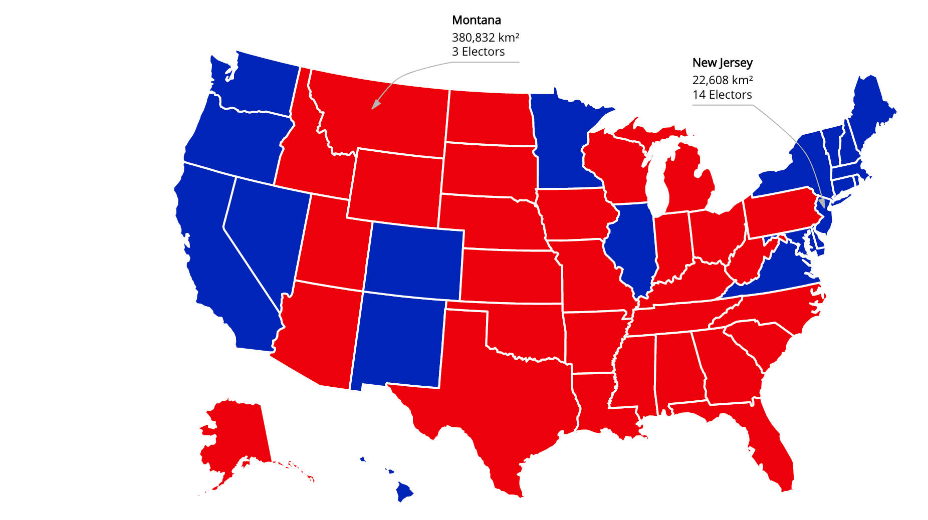
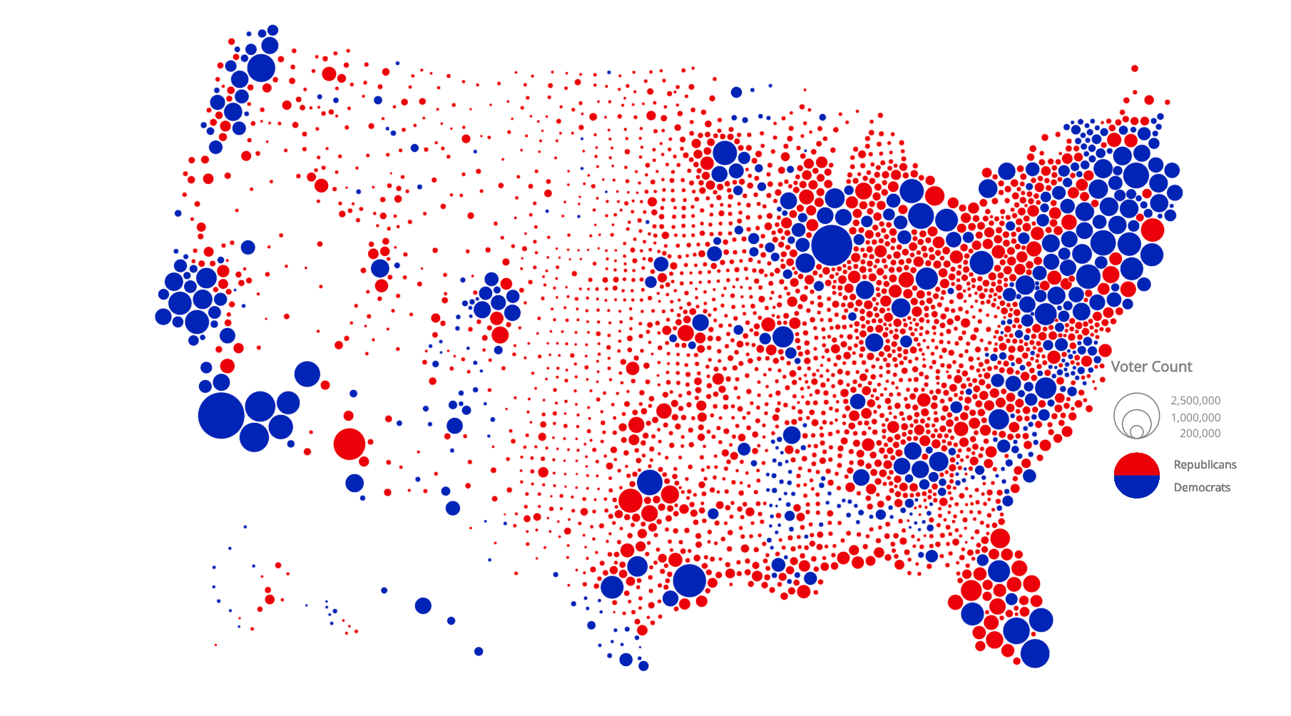
It goes without saying that if this GIF was created in 2019, it would be impossible for it to accurately depict the 2020 outcomes. The full Jetpack data visualization can be found here.