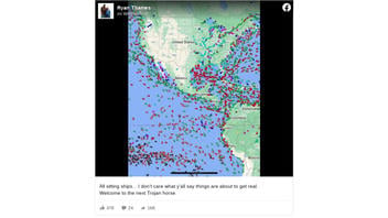
Does a viral screenshot of a live map of ships' locations exclusively show ships that are moored or anchored rather than underway? No, that's not true: The screenshot primarily shows ships underway, according to common iconography used on vessel-tracking websites and apps. The post appears to be related to claims about cargo ship backlogs in the U.S. and around the world.
The claim appeared in a Facebook post (archived here) on October 6, 2021. It included a screenshot of a live map from an unidentified ship-tracking program with a caption that reads:
All sitting ships... I don't care what y'all say things are about to get real.
Welcome to the next Trojan horse.
This is what the post looked like on Facebook on October 8, 2021:
(Source: Facebook screenshot taken on Fri Oct 8 15:16:15 2021 UTC)
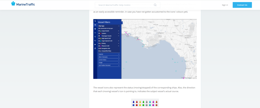
The screenshot of the map contains ship icons that represent the location of ships underway. According to the "Vessels" help page on MarineTraffic.com, a popular ship-tracking website, the type of vessel is differentiated by color while the movement of the vessel is differentiated by shape. Regarding the latter:
The vessel icons also represent the status (moving/stopped) of the corresponding ships. Also, the direction that each (moving) vessel's icon is pointing to, indicates the subject vessel's actual course.
A screenshot of the explanation of the vessel iconography is below:
(Source: MarineTraffic.com screenshot taken on Fri Oct 8 14:38:07 2021 UTC)
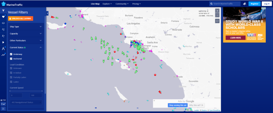
To demonstrate the difference, Lead Stories changed the filters on a live map from MarineTraffic.com. The first screenshot, below, shows both "Underway" and "Anchored" ships, as the filter section on the left indicates:
(Source: MarineTraffic.com screenshot taken on Fri Oct 8 14:33:28 2021 UTC)
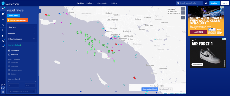
The second screenshot, below, shows only "Underway" ships. Notice that the only icons on the map are ones with points:
(Source: MarineTraffic.com screenshot taken on Fri Oct 8 14:34:15 2021 UTC)
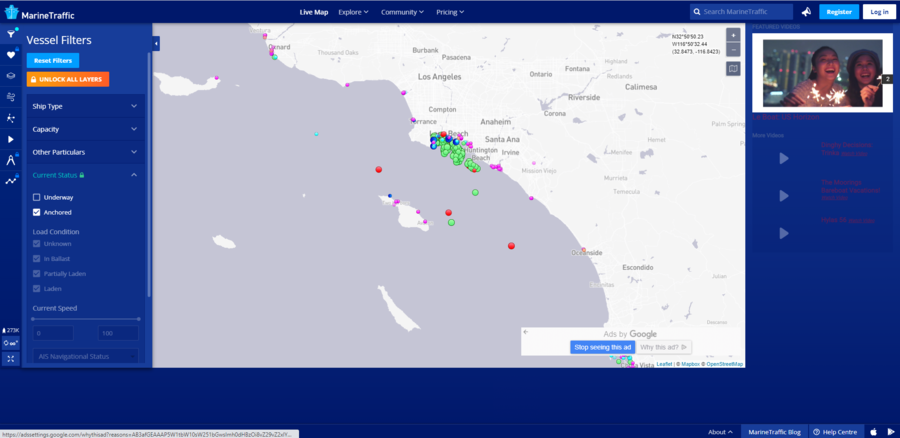
The third screenshot, below, only shows "Anchored" ships. Notice that the only icons on the map are circular:
(Source: MarineTraffic.com screenshot taken on Fri Oct 8 14:57:53 2021 UTC)
MyShipTracking.com, another ship-tracking website, displays its live map icons in a similar manner as shown in this screenshot from its "Icons" help page:
(Source: MyShipTracking.com screenshot taken on Fri Oct 8 14:53:56 2021 UTC)
The "Trojan horse" portion of the Facebook post is a reference to the Greek legend of the Trojan horse. The legend describes a large wooden horse -- presented as an offering -- that Greek soldiers hid in to take over the city of Troy during the Trojan War. The post seems to be suggesting that "sitting" ships, which appear harmless, were stationary for a more nefarious purpose.
Lead Stories previously debunked a claim that U.S. cargo ship backlogs in the latter half of 2021 were caused by states preventing ships from unloading their goods. Although there were several reasons for the backlogs, one of the primary causes was the lack of space due to an increased number of cargo ships that corresponded with more retail orders.


