
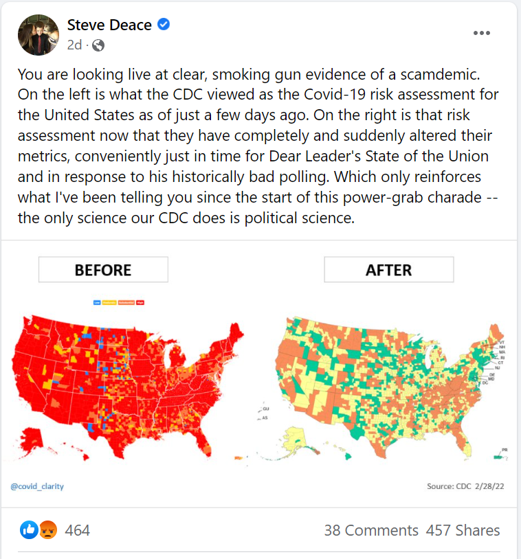
Did the Centers for Disease Control and Prevention (CDC) change a COVID-19 risk assessment map ahead of President Joe Biden's State of the Union address on March 1, 2022, to make it look better for the administration? No, that's not true: The maps being shared side-by-side on social media illustrate different aspects of the pandemic and use different color schemes to do so. One is not an update of the other.
The claim appeared in a Facebook post (archived here) published on March 1, 2022. It opens:
You are looking live at clear, smoking gun evidence of a scamdemic. On the left is what the CDC viewed as the Covid-19 risk assessment for the United States as of just a few days ago. On the right is that risk assessment now that they have completely and suddenly altered their metrics, conveniently just in time for Dear Leader's State of the Union and in response to his historically bad polling. Which only reinforces what I've been telling you since the start of this power-grab charade -- the only science our CDC does is political science.
This is what the post looked like on Facebook on March 4, 2022:
(Source: Facebook screenshot taken on Fri Mar 4 16:04:47 2022 UTC)
The two maps shown side-by-side in the Facebook post are not "before" and "after" versions of the same thing. The "before" map with its brilliant color scheme comes from the CDC's COVID Data Tracker and shows the level of community transmission across the United States on a county-by-county basis. This is what the map looked like on March 4, 2022:

(Source: CDC screenshot taken on Fri Mar 4 17:25:06 2022 UTC)
While the before map shows community transmission of COVID, it says nothing about the severity of those cases or how they're impacting local health systems.
The "after" map with its muted color scheme is also from the CDC, but serves a different purpose. It's called the U.S. COVID-19 Community Levels by County Map, which is a "measure of the impact of COVID-19 illness on health and healthcare systems." This is what the map looked like on March 4, 2022:
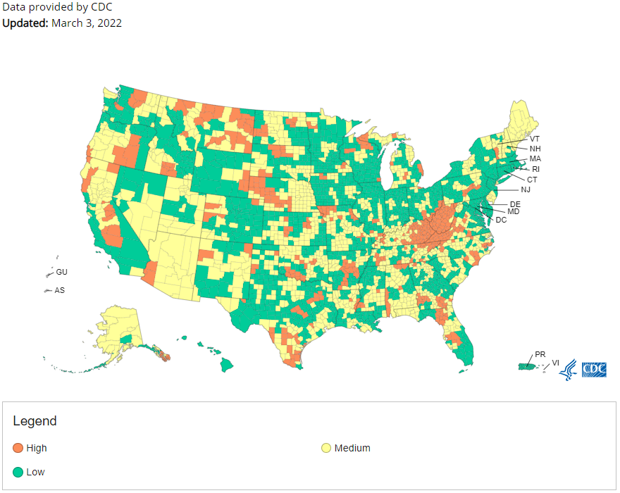
(Source: CDC screenshot taken on Fri Mar 4 17:25:06 2022 UTC)
When the CDC loosened its COVID-19 guidance on wearing masks in indoor public settings on February 25, 2022, the agency said it should be based on the COVID community level where you live. This map shows those levels. This is what the CDC says in its overview:
Health officials and individuals should consider current information about COVID-19 hospitalizations in the community, as well as the potential for strain on the local health system and COVID-19 cases in the community, when making decisions about community prevention strategies and individual behaviors. Communities and individuals should also make decisions based on whether they are at high risk for severe disease and take into account inequities in access to prevention strategies.
COVID-19 Community Levels can help communities and individuals make decisions based on their local context and their unique needs. Community vaccination coverage and other local information, like early alerts from surveillance, such as through wastewater or the number of emergency department visits for COVID-19, when available, can also inform decision making for health officials and individuals.