
Does a line graph in a peer-reviewed medical study published by The Lancet show that the oral anti-COVID-19 medication Paxlovid starts working before the patient ingests it? No, that's not true: The lead author of the study told Lead Stories that blue and orange lines on the graph start at zero, which is the origin of the graph's X-axis (horizontal line) and Y-axis (vertical line), and what the graph shows is that patients who have taken the medication see a lower risk of mortality and a shorter hospital stay compared to patients who did not take Paxlovid. "Day 0" on the graph is the day of the first PCR test, not the moment study subjects first took Paxlovid.
The claim appeared on Twitter (archived here) where it was published on February 19, 2023. The tweet read:
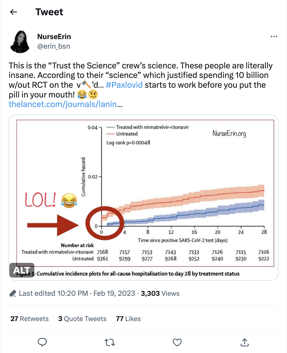
This is the "Trust the Science" crew's science. These people are literally insane. According to their "science" which justified spending 10 billion w/out RCT on the v🪓'd... #Paxlovid starts to work before you put the pill in your mouth! 😂🥴 https://www.thelancet.com/journals/lanin/issue/current
This is what the post looked like on Twitter at the time of writing:

The link to the study the Twitter user posted is broken. An active link to the study can be found here.
Paxlovid is an oral drug, developed by Pfizer, used to treat mild to moderate COVID-19 for people who are at a high risk of serious illness.
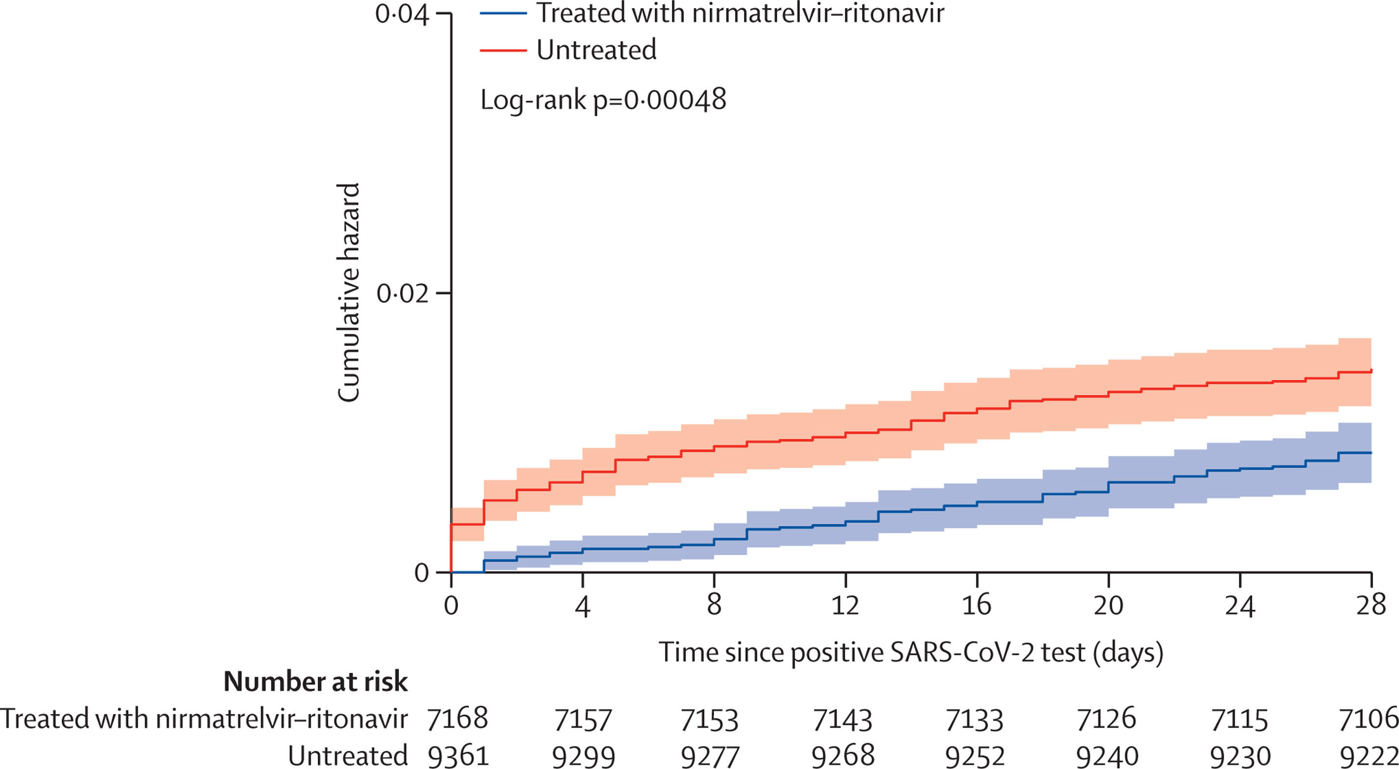
Here is the full study with the graph in the tweet being Figure 1. Looking at the graph, there are two lines. The orange one is untreated patients with COVID-19, and the blue line is patients who have COVID-19 but have been treated with Paxlovid. A closer look at the graph shows that both of the lines start at zero.
(Source: The Lancet screenshot taken on Wed Feb 22 16:51:28 2023 UTC)
On the x-axis is the time since a positive COVID-19 test in days, and the y-axis measures "cumulative hazard." A cumulative hazard can be thought of as answering the question, "What is the total accumulated risk of experiencing this event while times goes on?" with the event here being a positive COVID-19 test.
The study breaks down the results of the chart like this, "Treatment with nirmatrelvir-ritonavir was associated with significantly lower 28-day all-cause mortality compared with untreated patients ... Additionally, among the subset of hospitalised patients in our cohort, nirmatrelvir-ritonavir treatment was associated with a shorter mean hospital length of stay compared with the untreated group". Nirmatrelvir-ritonavir is the scientific name from Paxlovid. All-cause mortality means a death due to any cause. This graph shows that patients who were treated with Paxlovid had less deaths than untreated patients. The Paxlovid patients also had shorter hospital stays compared with the patients who did not take the medication.
Dr. Neil Aggarwal, the lead author of this study, responded to an inquiry from Lead Stories by email on February 23, 2023:
The claim is not correct. Paxlovid is effective after its use. Because the time zero in this figure is the date of the first PCR test, the figure represents cumulative hospitalizations since symptom onset and home testing. This explains the spike in the orange line at day 0. The blue line also starts at day 0, but there are no events on day 0, and they start at day 1 ... Furthermore, these assumptions were rigorously tested with a number of sensitivity analyses that varied assumptions, all of which were supportive of the conclusions.
Sensitivity analysis is a method that measures how the results of uncertainties of one or multiple of the input variables can lead to one or more uncertainties for the output variables.
In a February 23, 2023, email, a representative for Pfizer media relations told us this:
That chart has to show starting at zero. All charts begin at that to show the number of participants as it grows. The chart shows there is a higher number of hospitalizations for people who aren't treated.