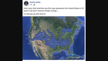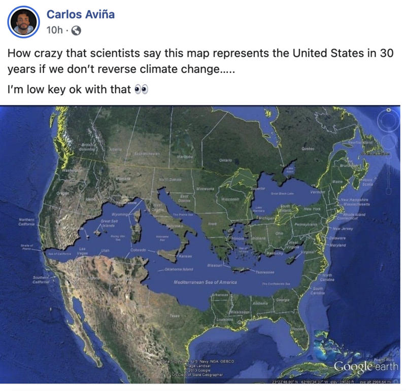
Does this image of a map show what a scientist thinks the United States will look like in 30 years if climate change is not reversed? No, that's not true: The image is a digital manipulation created to show the size of the Mediterranean Sea relative to familiar U.S. land masses.
The map appeared in a Facebook post on July 11, 2022. The caption reads:
How crazy that scientists say this map represents the United States in 30 years if we don't reverse climate change.....
I'm low key ok with that 👀
This is what the post looked like on Facebook at the time of writing:
(Source: Facebook screenshot taken on Tue July 12 16:30:49 2022 UTC)
While there have been recent surveys and reports about the negative impact of climate change and sea level rise in the U.S., the image in this post does not depict any actual scientific conclusion as to what the U.S. would look like in 30 years due to climate change.
A TinEye reverse image search of the map shows it is an illustration in a December 26, 2015, Tumblr post titled, "The Mediterranean Sea of America," by architect Bret Drager. He displays the exact image in the Facebook post and describes it as a digital manipulation created to show how big the Mediterranean sea is and how it would fit when laid over the U.S.
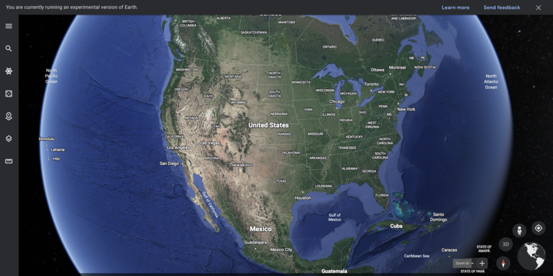
A correct display of the U.S. using earth.google.com can be seen here.
An evidence-based depiction of climate change mapped over time in the U.S. can be viewed on the climate.gov website.


