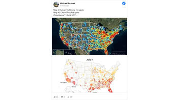
Does a comparison of maps show there is a shocking connection between human trafficking hotpsots in the United States and coronavirus outbreaks? No, that's not true. A meme that has gone viral showing two maps of the U.S. with heavy numbers in the same area - one with "human trafficking hot spots" and another with "China Virus hot spots." There is a correlation but no causation between the two maps. There will be more examples of human trafficking and COVID-19 outbreaks because more people live in these locations. There is no evidence that the two situations are related and almost any map of the country would show heavy density in those areas because that is where the most people live.
The claim appeared as a post (archived here) where it was published by Facebook on July 24, 2020 It opened:
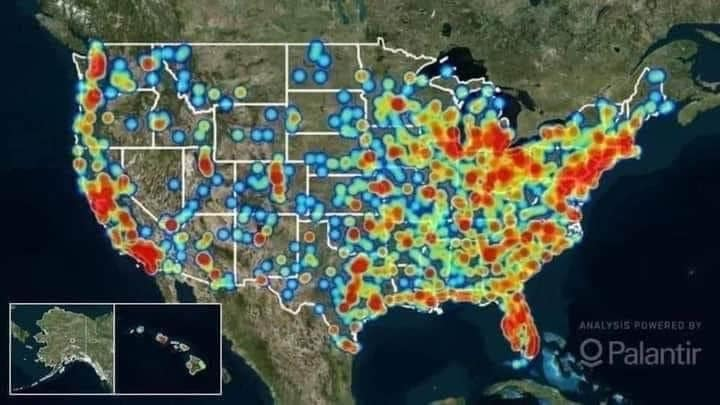
Map 1 Human Trafficking hot spots
Map #2 China Virus hot spots
Coincidence? I think NOT...
This is what the post looked like on Facebook at the time of writing:
(Source: Facebook screenshot taken on Fri Jul 24 17:49:02 2020 UTC)
Both of these maps are valid maps but there is no connection between the two and a comparison of almost any query in the United States will have a large number in the same area because that is where the majority of people live.
The human trafficking map is from the Polaris Project and shows human trafficking hot spots in 2018.
The second map is from the USA Today newspaper and shows COVID-19 outbreaks in the U.S. as of July 1, 2020.
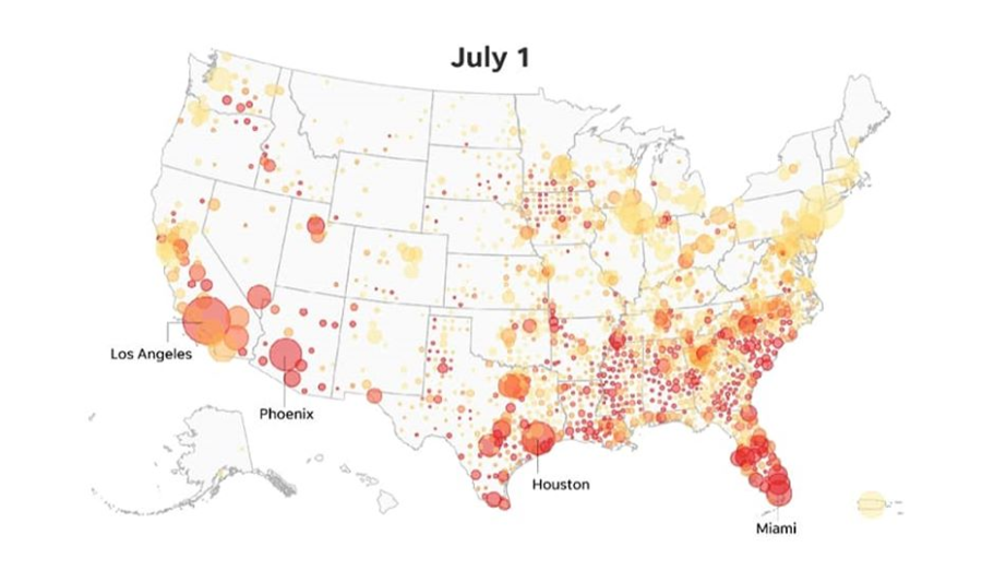
The colors on both maps correspond to areas where there is a high population.
Look at this map of the United States Population Density - it has similar areas with high colors.
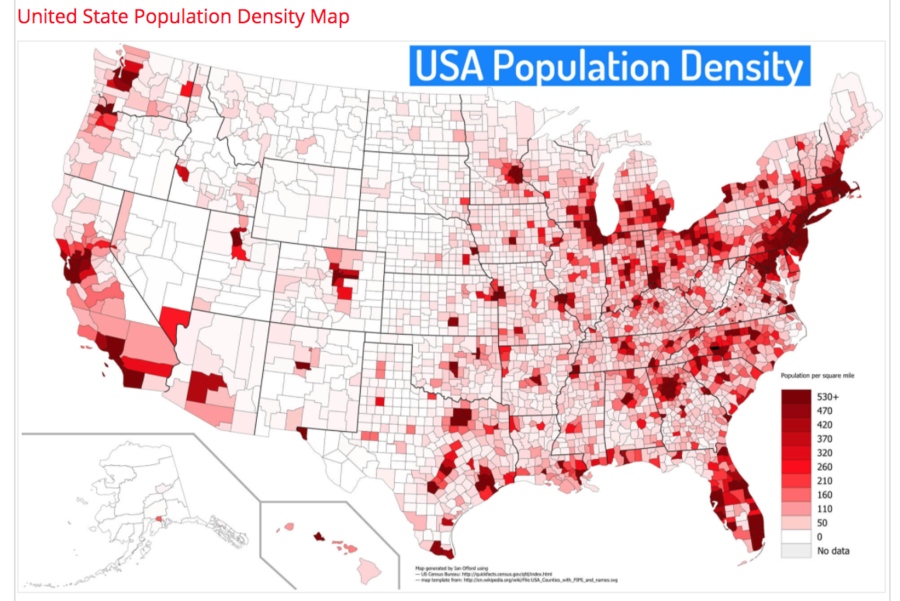
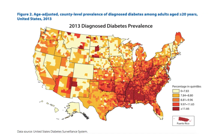
A map of a statistic that has nothing to do with human trafficking or coronavirus has a similar pattern.
This map published on Business Insider from the CDC shows the cases of diabetes in the United States in 2017, also looks similar to the two maps used in the Facebook post.
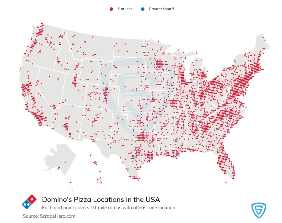
John Oliver debunked a very similar conspiracy theory on his show "Last Week Tonight With John Oliver," showing maps of 5G rollout, coronavirus, population density and even Domino's pizza locations.
Oliver explained the connection:
It made the rounds helped by images like these, showing maps of coronavirus cases, alongside maps of the 5G rollout. And initially, the similarity there does seem striking, until you realize, those maps also look like the ones of population density, which makes a lot more sense. Because that's correlation, not causation.
Wi-Fi rollouts and virus cases will both be where there are a lot of people.
In fact, lots of maps look like those maps. This one of Domino's pizza locations looks like a map of coronavirus outbreaks, and I'm pretty sure Domino's pizza isn't causing it. Yes, their Wisconsin six cheese will give you a dry cough, fever, diarrhea, and COVID toe, but not in the exact same way as the coronavirus. And knowing the difference is called science."
Oliver used similar maps in his story, including one of the Domino's pizza locations in the United States.


