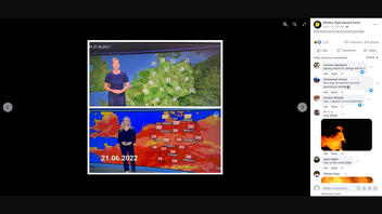
Does a comparison of two German news channel weather maps -- one from 2017 and one from 2022 -- prove that climate change isn't real? No, that's not true: Although the map from 2017 has higher temperatures than the 2022 map, one is a topographic map and the other is a heat map, which explains their different appearances.
The claim appeared in a Facebook post on July 21, 2022. The post has two images of weather maps from separate German news channels. The map labeled June 21, 2017, had a green landscape showing temperatures in Germany, while the map labeled June 21, 2022, with a bright red and orange landscape, showed lower temperatures in Germany. The caption of the post read:
DOOOOOOOOOOOOOOOOOOOOM!
The caption was a sarcastic suggestion that the bright colors used in the 2022 maps would make viewers feel more alarmed about the temperatures in Germany, even though those temperatures were lower than those shown in the 2017 map.
This is what the post looked like on Facebook at the time of writing:


(Source: Facebook screenshot taken on Mon Jul 25 14:43:57 2022)
The map comparison has made the rounds online (here, here and here) but the maps cannot be compared. Leo Hickman -- director and editor of Carbon Brief, which says on its site it is "a UK-based website covering the latest developments in climate science, climate policy and energy policy" -- tackled the claim on Twitter in a thread published on July 22, 2022. The June 21, 2017, map appeared to show a topographic map, which depicts the surface of the area shown in the map. Here is an example of a German weather newscast from June 21, 2017, that shows a topographic map.
Conversely, the June 21, 2022, map appeared to show a heat map. The same German weather newscast from June 21, 2017, discussed above shows a heat map, presumably for another day in the week, that uses similar colors to the heat map shown from the newscast on June 21, 2022.
Reuters also debunked another online effort with two dissimilar maps to try to implicate media in the United Kingdom.
According to climate scientists, global warming is very real (here, here, here, here and here).
More Lead Stories fact checks related to climate change can be found here.