
Does a warmer average temperature in May 1895 compared to May 2024 disprove global warming, as a post with a chart on social media implied? No, that's not true: Climate experts contacted by Lead Stories said the data was cherry-picked and misleading and that the data chart was altered so as to mislead readers about the long-term trend. Short-term fluctuations in temperature do not invalidate long-term global warming trends, which are supported by extensive scientific evidence showing a consistent rise in global average temperatures over the last 100 years.
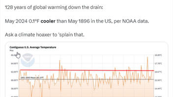
The claim appeared in a post (archived here) published on X, formerly Twitter, on June 17, 2024, under the on-screen title "Contiguous U.S. Average Temperature." The post's caption said:
128 years of global warming down the drain:
May 2024 0.1°F cooler than May 1896 in the US, per NOAA data.
Ask a climate hoaxer to 'splain that.
This is what the post looked like on X at the time of writing:
(Source: X screenshot taken on Mon Jun 17 15:06:15 2024 UTC)
Climate experts
Northwestern University
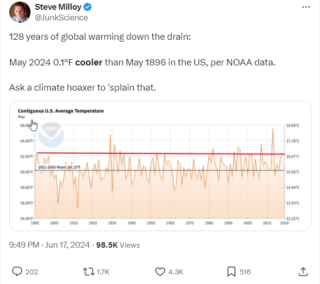
Brad Sageman, a professor of earth and planetary sciences at Northwestern University, told Lead Stories in a June 18, 2024, email, that he sees a problem with the graphic in the social media post. He said it's been altered:
Whoever posted the figure doctored that image ... the red line across the plot is NOT what is on the original NOAA [National Oceanic and Atmospheric Administration] figure ... instead, there is a line that slopes up from left to right showing the decadal-scale increase in average surface temps within the contiguous U.S.
The climate system has and will always have shorter-term oscillations in extremes. The question of 'global warming' is only addressed by looking at longer-term average values. They have been steadily rising, and at a markedly higher rate of change since the 1980s.
Here's what the original chart, with the upward-sloping blue trend line, left to right, looks like on the NOAA website:
(Source: NOAA screenshot taken on Mon Jun 17 16:37:58 2024 UTC)
University of Georgia
In a June 18, 2024, email to Lead Stories, Patricia Yager, professor of Marine Science at the University of Georgia and director of the Georgia Climate Project, expressed her concern over the limited scope of the social media post. Yager said (emphasis hers):
Cherry-picking two dates to say 'nothing has changed' over a time series with a high degree of variation is erroneous. ...
But ... that this is only data for the United States (<2% of the earth surface area), is really the most important. A global map of the temperature anomaly shows that the contiguous US has not been as hard hit by climate change as other regions.
Oregon State University
Karen Shell, a professor of Practice, Atmospheric Sciences at Oregon State University, noticed the same missing trend line in the social media post as Sageman did. In a June 18, 2024, email to Lead Stories, she said it illustrates important data:
The blue line (trend line) shows that, on average, May contiguous U.S. temperatures have been increasing by 0.11 degree F per decade. Your note that the original plot is US temperatures only is important, too. Generally, when you average over wider regions or longer time periods, the up-and-down variation you see in the plot decreases, and the long-term trend becomes clearer.
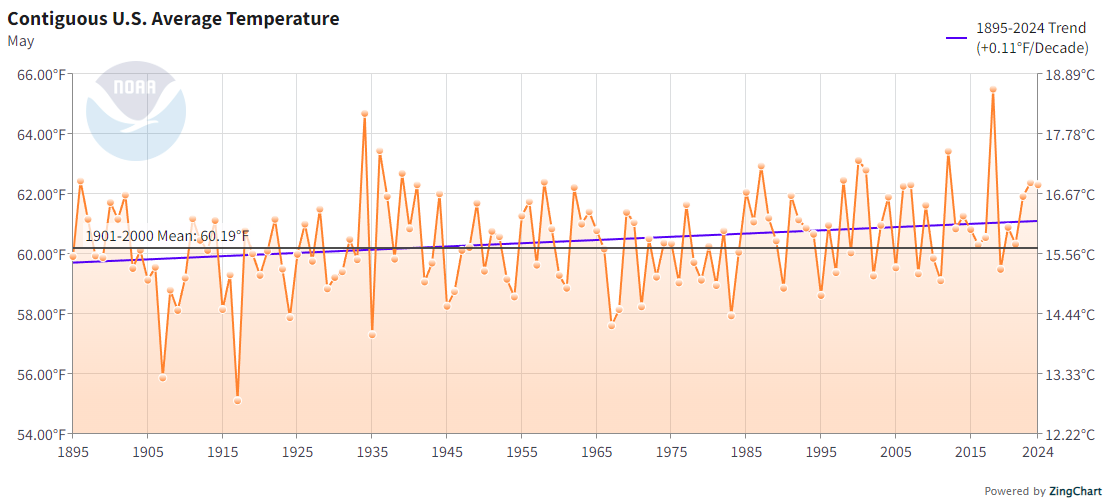
Shell's email included the following image from the NOAA website, which shows "Global Land and Ocean May Average Temperature Anomalies," not just from the U.S., since 1850. Globally, the average May temperature has been above average every year since the late 1970s. The red bars show above average and the blue bars show below average):
(Source: NOAA screenshot taken on Mon Jun 17 17:49:47 2024 UTC)
Shell said additional climate change information is available here and here.
University at Buffalo
"Reports like this make me so frustrated!" said Susan Clark, an assistant professor with the Department of Environment & Sustainability at the University at Buffalo. In a June 18, 2024, email to Lead Stories, she said of the social media post, "This does not disprove global warming, or more accurately called climate change." Clark continued:
You cannot pick a single day, month or year and claim that because it was cooler or had less snow, etc. that it is a sign that global warming is a hoax. If the report claims were correct but instead focused on the year before (May 1895), you could claim the opposite, and use it as proof of climate change.
The report is cherry-picking specific weather information and using it incorrectly to make assumptions about much longer-term climate trends.
National Oceanic and Atmospheric Administration
Erica Grow Cei, a NOAA public affairs specialist and meteorologist, echoed the other experts' accounts of the information in the social media post. In a June 18, 2024, email, she said:
It probably goes without saying, but this cherry-picked data set is not representative of the global average temperature in the same time period.
Cei also directed Lead Stories to a NOAA article (archived here) published on October 12, 2022, titled "If the globe is still warming, then why are some locations not warming while others have experienced cooling?" to explain some of the nuances of climate change. The article opens:
Global warming means Earth's annual average air temperature is rising over long time spans (many decades to centuries), but not necessarily in every location and not necessarily in all seasons. It's like your grades--if you get Bs and Cs in your first semester and in the next semester you get all As and Cs, your overall grade point average rises even though you didn't improve in every class. Differences in exposure to sunlight, cloud cover, atmospheric circulation patterns, aerosol concentrations, atmospheric humidity, land surface cover, etc., all vary from place to place which, in turn, influence whether and how much a location is warming or cooling.
Additional details from NOAA on climate change are available here, here, here, and here.
Read more
Other Lead Stories articles on claims regarding NOAA and climate change are here.


